


Landing pages play a critical role in converting website visitors into leads or customers. Whether you’re running paid ads, promoting a new product, or gathering sign-ups for a newsletter, a well-crafted landing page can be the key to achieving your marketing goals.
In this blog, we’ll explore the essential elements of a high-converting landing page and how you can implement them to maximize your conversion rate.
What’s the Purpose of a Landing Page?
At its core, a landing page is a standalone web page created for a specific marketing campaign. Unlike a homepage or service page, which might contain multiple calls to action (CTAs), a landing page is singular in its purpose—whether that’s collecting email addresses, driving webinar sign-ups, or promoting a sale.
Key Features of a High-Converting Landing Page
A high-converting landing page is defined by its clarity, focus, and simplicity, all geared toward driving a specific user action.
The most critical aspect of a successful landing page is its focused objective. Unlike other pages on a website that may serve multiple purposes, a landing page is designed to achieve one goal, whether that’s capturing a lead, encouraging a download, or prompting a purchase.
To ensure this focus, the page should be free from distractions like navigation menus, links to other parts of the site, or excessive content that could lead the visitor away from the intended action. By eliminating unnecessary elements, the visitor’s attention is directed solely toward the call to action, increasing the likelihood of conversion.
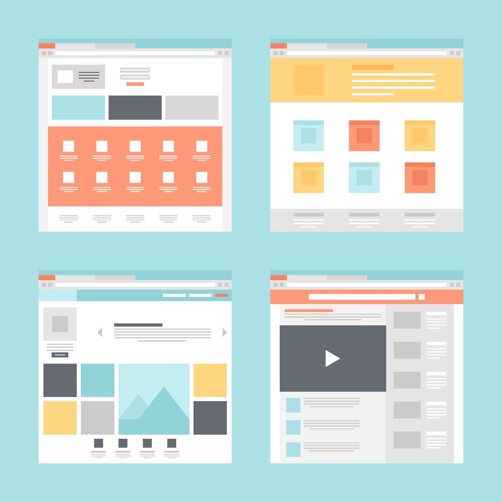
Types of Landing Pages
There are a number of different types of landing pages, each serving distinct purposes. Here are a couple of basic examples:
Lead Capture Landing Pages
Lead generation landing pages are specifically designed to capture user information, often through a form. These pages might offer something of value in exchange for contact details, such as a free eBook, a demo, or a newsletter subscription. The goal here is to generate leads that can be nurtured into customers over time.
Click-through Landing Pages
On the other hand, click-through landing pages function as an intermediary step, guiding visitors toward another important page, typically a product or checkout page. These pages are particularly effective in e-commerce, where the goal is to warm up visitors with information or offers before directing them to finalize their purchase.
Audience and Message Alignment
One of the most common mistakes marketers make is failing to align their landing page message with their audience’s needs. Effective landing pages speak directly to the visitor by addressing their pain points, offering clear solutions, and reflecting the messaging that brought them to the page in the first place—whether that’s from a paid ad, email, or social media campaign.
How to Align Message and Audience
Know Your Audience: Build buyer personas to understand who you’re speaking to. Consider their pain points, desires, and what motivates them.
Keep Messaging Consistent: If a user clicks on a Facebook ad promising a free eBook, the landing page should clearly reflect that offer. Disconnected messaging creates confusion and decreases trust.
A/B Testing: Test different versions of your message to see which resonates more with your audience. Sometimes subtle changes in wording or structure can lead to significant differences in conversion rates.
Craft a Compelling Headline and Subhead
Your headline is likely the first thing visitors see, and it sets the tone for the entire landing page. A well-crafted headline grabs attention, communicates value, and motivates users to keep reading. The subhead works in tandem with the main headline, providing further context or emphasizing the benefits.
Tips for Creating Effective Headlines
Clarity is Key: Don’t leave visitors guessing. Your headline should immediately communicate what the page is about.
Highlight the Value Proposition: What’s in it for the visitor? Be direct about how your offer will solve their problem or fulfill their need.
Subheads Matter Too: Use the subhead to provide supporting information or reinforce the benefit promised in the headline.
For example, a strong headline might read, “Get 50% Off Our Best-Selling Course Today!” with a subhead that says, “Limited time offer – Learn expert strategies to boost your digital marketing skills.”
Designing a Clear, Strong Call to Action (CTA)
The call to action is arguably the most important part of your landing page. It’s the button or link that encourages visitors to take the desired action, whether it’s signing up for a webinar or purchasing a product.
Best Practices for Creating Effective CTAs
Action-Oriented Language: Use verbs that clearly tell visitors what to do (e.g., “Download Now,” “Start Your Free Trial,” “Claim Your Offer”).
Emphasize Benefits: Make it clear what users get by clicking the CTA (e.g., “Get Your Free eBook” rather than “Submit”).
Strategic Placement: Place the CTA where it’s easy to find—usually above the fold. In long-form landing pages, consider repeating the CTA at strategic points.
Create Trust with Social Proof and Testimonials
Building trust is essential for conversions. Social proof, such as testimonials, client logos, and reviews, provides third-party validation that reassures visitors they’re making a smart decision.
How to Incorporate Social Proof
Customer Testimonials: Showcase quotes from satisfied customers that highlight the benefits of your product or service.
Case Studies and Success Stories: Provide real-world examples of how your offering has helped others.
Trust Badges and Certifications: Displaying awards, certifications, or partnership logos can boost credibility.
It’s important to place social proof strategically—usually near the CTA or in a section that encourages visitors to take the next step.
Optimizing Forms for Conversions
Forms are often the gateway to collecting leads, but they can also be a barrier if not designed properly. The key to a high-converting form is to ask for just enough information without overwhelming the visitor.
Tips for Creating Effective Forms
Keep It Short: Only ask for the information you absolutely need. Every additional field can reduce conversions.
Use Clear Labels: Ensure that form fields are clearly labeled and easy to understand.
Mobile-Optimized Forms: Given the increase in mobile users, make sure your form is responsive and easy to fill out on a small screen.
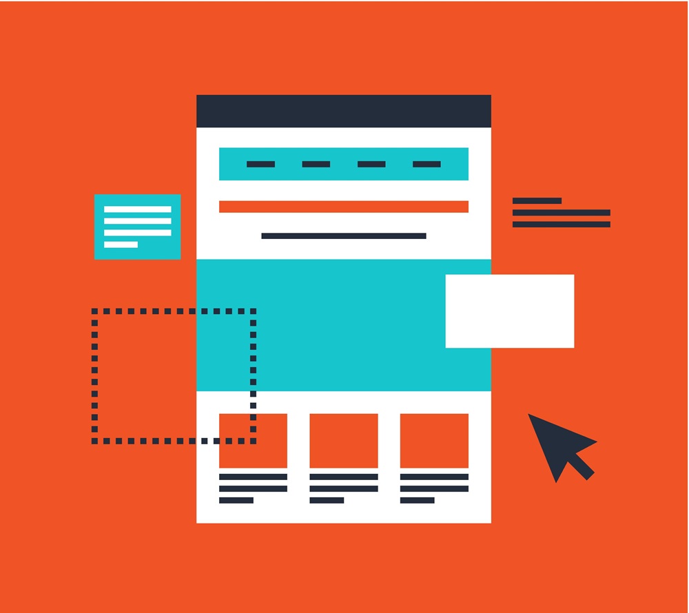
Design and Layout: Simplicity, Visual Hierarchy, and Focus
A clean, focused design helps guide users toward your CTA without distraction. Your landing page should have a clear visual hierarchy that leads visitors step by step through the page toward the action you want them to take.
Design principles you should be following:
Minimize Distractions: Remove unnecessary elements like complex navigation menus that can lead visitors away from your goal.
Use White Space: Allow your content to breathe by using ample white space around key sections.
Mobile Responsiveness: Make sure the page looks great and functions properly across all devices, especially mobile.
The Power of Visuals and Video
Humans process visuals much faster than text, and using high-quality images or videos can enhance the overall appeal of your landing page.
How to use visuals effectively:
Relevant Imagery: Use images that support your message and resonate with your audience (e.g., product images, lifestyle photos).
Video Testimonials or Demos: Incorporating video can boost engagement and conversions. Explainer videos, customer testimonials, or product demos can significantly increase trust and interest.
Optimize for Speed: Ensure that all images and videos are optimized for fast loading, as slow performance can hurt conversion rates.
The Importance of Page Speed and Performance
A slow-loading landing page can have devastating effects on conversion rates. Studies show that even a one-second delay in page load time can reduce conversions by 7%.
How to Improve Page Speed
Compress Images: Use tools like TinyPNG to reduce image file sizes without sacrificing quality.
Limit Redirects: Too many redirects can slow down the page. Minimize their use where possible.
Use Browser Caching: Store page resources in a browser cache so the page loads faster for returning visitors.
Use Analytics to Continuously Improve
Landing pages should never be static. Even the best-designed pages need continuous testing and optimization to improve conversion rates.
Metrics you should be monitoring:
Conversion Rate: The percentage of visitors who complete the desired action.
Bounce Rate: The percentage of visitors who leave without interacting with the page.
Time on Page: How long visitors are staying on the page. A low time on page can indicate that your content isn’t engaging.
By leveraging tools like Google Analytics, Hotjar, and A/B testing platforms, you can gather insights on user behavior and make data-driven decisions to improve your landing page over time.
Creating a high-converting landing page involves a delicate balance of clear messaging, compelling design, and continuous optimization. By focusing on the key elements we’ve outlined you can craft landing pages that drive meaningful results.
