


Designing a logo from scratch can be an exhilarating yet challenging journey. A logo not only represents a brand’s identity but also communicates its values, ethos, and uniqueness.
Whether you’re a budding designer or a business owner wanting to craft your brand identity, we’re going to walk you through the steps to design a memorable and effective logo from scratch.
Understand the Brand
Before you sketch a single line, it’s imperative to immerse yourself in the brand. A successful logo reflects the brand’s essence and speaks to its target audience. Here are key aspects to consider:
Brand Identity
Understanding a brand’s identity involves more than reading the mission statement; it’s about uncovering the soul of the brand. Consider the following:
Mission: What’s the core purpose of the brand? Why does it exist? This often ties directly to the emotions or solutions the brand aims to evoke or provide.
Values: What principles guide the company’s actions and decisions? How do these values influence its relationships with customers? For example, a commitment to sustainability can significantly influence design choices, leading to organic shapes and green color palettes.
Personality Traits: If the brand were a person, how would you describe its personality? Is it professional and authoritative, or playful and approachable? This aspect will heavily influence the logo’s tone and style.
Target Audience
The logo must appeal to the specific demographics the brand targets. This requires an understanding of:
Demographics: Age, gender, income level, education, and more. These elements define the foundational approach to the design.
Psychographics: Interests, hobbies, and lifestyle. For example, a luxury brand targeting high-income individuals might opt for a minimalist and sophisticated design.
Preferences: Visual preferences can vary significantly across different groups. Younger audiences might gravitate towards more vibrant and modern designs, while older demographics might appreciate more traditional and understated logos.
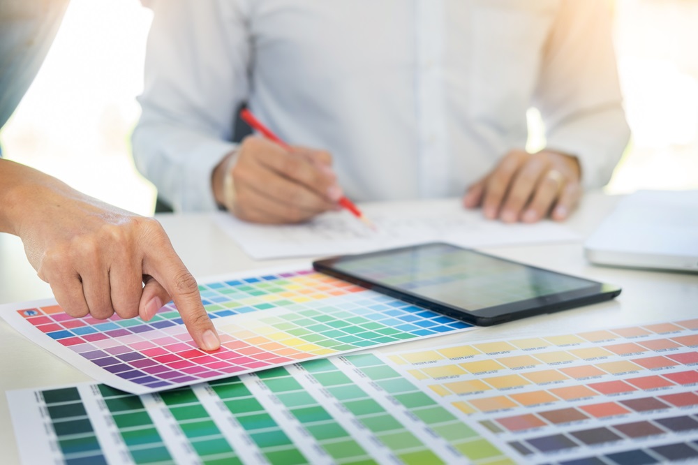
Market Position
![]()
Understanding a brand’s market position through a SWOT analysis is a crucial aspect of the logo design process, as it helps the designer capture the essence of the brand in relation to its operational environment. Here’s how you can perform a detailed SWOT analysis and apply its insights to the logo design process:
Strengths: Identify what the brand does well, unique resources it possesses, and how it’s perceived positively in the market. This could include a loyal customer base, a unique selling proposition (USP), or innovative technology. For the logo design, this means emphasizing these strengths visually. For example, if a brand is renowned for its heritage and craftsmanship, the logo should convey this through classic design elements and refined typography.
Weaknesses: Acknowledge areas where the brand falls short compared to competitors. This might be higher pricing, limited product lines, or geographic reach. Understanding these weaknesses allows the designer to strategically use the logo to mitigate negative perceptions. For instance, a brand perceived as expensive could benefit from a logo that emphasizes value and quality, perhaps through a clean, minimalist design that suggests efficiency and straightforwardness.
Opportunities: Look at external factors that the brand can capitalize on. This could be an emerging market trend, a gap in the market, or changing consumer behaviors that favor the brand’s offerings. The logo should be designed to make the most of these opportunities. If there’s a growing trend towards sustainability and the brand has eco-friendly practices, incorporating green elements or motifs that suggest nature could be effective in the logo design.
Threats: Consider external challenges that could pose problems for the brand, such as new competitors, regulatory changes, or shifts in customer preferences. The logo should be designed to stand out in a crowded market and convey a sense of reliability and trust if industry volatility is a threat. For example, using a bold and straightforward typeface and a strong, stable color like blue can help project stability and confidence.
Research and Inspiration
The research and inspiration phase is critical for grounding the logo design in a context that is both aware of the competition and ripe for innovation.
Competitor Analysis
Visual Positioning Across Platforms: Begin by examining how competitors use their logos across various mediums, such as websites, social media, product packaging, and physical storefronts. Assess their use of colors, typography, and imagery to understand their brand positioning.
Common Themes: Identify recurring motifs or design elements that are prevalent in your industry. For instance, tech companies might favor blue and gray palettes to evoke professionalism and trust.
Disruption Opportunities: Look for design elements that are overused or clichés that could be reinvented. Consider how your design can introduce a fresh perspective or fill a void in visual representation within the market. For example, if most competitors use a minimalist style, perhaps a more detailed or handcrafted design could stand out.
Trends
Current Design Trends: Keep abreast of the latest design trends by following design blogs, attending industry conferences, and reviewing award-winning designs. Look for patterns in color choices, typography styles, and logo formats (e.g., dynamic logos, minimalist marks).
Future Projections: Engage with futurists or trend prediction resources to understand where design might be headed in the next few years, particularly with the integration of new technologies. For example, consider how augmented reality and virtual reality could impact logo visibility and interaction.
Technology’s Impact: Evaluate how emerging technologies like AI and machine learning could influence design aesthetics. This might involve exploring how logos can be adapted for digital-first experiences or how they might evolve dynamically in response to user interactions.
Inspiration
Global Art Forms: Look beyond Western design principles and explore art from various cultures, such as Aboriginal dot paintings, African tribal motifs, or Scandinavian minimalism. Each tradition can offer unique geometries, color combinations, and compositions that can inspire innovative logo designs.
Scientific Innovations: Science can be a rich source of inspiration, especially for creating logos that resonate with tech-savvy or intellectual audiences. For instance, consider the structures of molecules, fractals in nature, or the color theories based on light physics.
Philosophical Concepts: Incorporating philosophical ideas can add depth to your design. For instance, the concept of yin and yang can inspire a logo that balances dualities within the brand. Exploring existential themes, principles of harmony, or even the philosophy of minimalism can influence the design direction in profound ways.
By expanding your research and inspiration efforts you can craft a logo that is not only visually captivating and distinctive but also deeply resonant with the brand’s identity and its place in the cultural, technological, and economic landscape.
Conceptualization and Sketching

The conceptualization and sketching phase is where a logo starts to take form, translating abstract ideas into tangible representations. This stage is crucial for experimenting with different concepts and iteratively refining them based on aesthetic and functional evaluations.
Brainstorming
Use techniques like SCAMPER (Substitute, Combine, Adapt, Modify, Put to another use, Eliminate, Reverse) to challenge conventional ideas and explore creative avenues.
- Substitute – Identify elements in existing designs that can be replaced with something unexpected. For example, substituting traditional shapes with more organic forms to add uniqueness.
- Combine – Merge different concepts or visual elements. This could mean combining a letterform with an icon to create a memorable logo.
- Adapt – Modify an existing design or idea to serve the brand differently. This can involve adapting classical motifs to fit a modern context.
- Modify – Change aspects such as scale, angle, or proportions to enhance the design’s impact or readability.
- Put to another use – Take a concept or element that is used in one way and repurpose it creatively. For example, a wave pattern could be used not just as a water symbol but also to represent sound waves if the brand is in the audio industry.
- Eliminate – Remove elements to simplify and strengthen the design. This can help in achieving a more minimalist and clean logo.
- Reverse – Invert the expected norms of the design or conceptual approach, such as designing a logo that works upside down or integrates ambigrams for a versatile appearance.
Mind Mapping and Word Associations: Start with the brand name or key concept at the center and branch out with related words, ideas, and visual themes. This visual approach helps uncover unexpected connections and inspirations.
Sketching
Initial Sketches: Begin with quick, unfiltered sketches to capture as many ideas as possible. This rapid sketching phase is more about quantity than quality, aiming to explore a wide range of concepts.
Digital Sketching: Use digital tools to further experiment with the sketches. Digital sketching allows easy manipulation of elements (resizing, rotating, adjusting opacity) and can accelerate the iteration process.
Refinement: Select the most promising ideas and refine them into more detailed sketches. This stage focuses on enhancing the clarity and detail of the designs, considering how they will look both in large formats and as small icons.
Variations: Create variations of each refined sketch to explore different color palettes, typographic pairings, and layout adjustments. This can include testing the logo in various real-world applications, like on business cards, websites, or merchandise, to ensure versatility and functionality.
Feedback Loops: Present sketches to peers, mentors, or even potential users to gather insights and criticisms. Use this feedback to make informed adjustments that align the logo more closely with the brand’s goals and audience expectations.
By thoroughly engaging in brainstorming and sketching, designers can ensure that the logo is not only visually appealing and unique but also a true visual ambassador for the brand it represents.
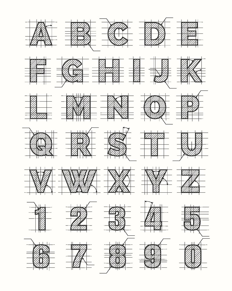
Design Execution
![]()
The design execution stage is where the theoretical concepts and preliminary sketches are transformed into a refined, professional logo. This phase involves attention to detail, mastery of design tools, and an understanding of visual principles to ensure the final product is both aesthetically pleasing and functionally sound.
Software Tools
Vector Graphics Editors: Programs like Adobe Illustrator and CorelDRAW are staples for creating scalable vector graphics. These tools are essential for ensuring that logos retain their clarity and quality across all sizes and mediums.
3D Modeling Software: For brands looking to stand out with a modern edge, software like Blender or Autodesk 3ds Max can be used to create three-dimensional logo designs. These logos can be particularly effective in digital spaces where a dynamic or interactive element can be leveraged.
Hand-drawing and Digital Painting: Tools like Procreate or Adobe Fresco allow designers to add hand-drawn elements to logos, giving them a unique, organic feel that can convey warmth and personal touch. These elements can then be digitized and refined in vector graphic software.
Typography
 Typographic Pairing: The choice of typefaces should complement the logo’s iconography and overall design ethos. For example, a modern, minimalist logo might pair well with a sans-serif font, while a more traditional brand could opt for a serif typeface.
Weight and Kerning: The weight of the typeface affects readability and visual impact. Heavier weights can convey strength and presence, while lighter weights might feel more elegant and approachable. Kerning, or the spacing between characters, must be carefully adjusted to ensure the logo is legible and aesthetically balanced at various sizes.
Custom Typefaces: Designing a custom typeface or modifying an existing one can significantly differentiate a brand. This customization allows the logo to not only stand out but also to be closely tied to the brand’s identity, making it harder for competitors to mimic.
Color Theory
Psychological Impact: Colors evoke specific emotions and associations. For example, blue often represents professionalism, trust, and tranquility, making it popular among financial institutions and healthcare companies. Understanding these associations is crucial in choosing a color palette that aligns with the brand’s messaging.
Cultural Context: Color perceptions can vary dramatically across different cultures. For instance, while white is often associated with purity in Western cultures, it can represent mourning in some Eastern cultures. Such nuances must be considered, especially for brands operating in global markets.
Unconventional Color Schemes: Experimenting with unconventional color schemes can set a logo apart from its competitors. This might involve using contrasting colors for vibrancy, monochromatic schemes for harmony, or even metallic or neon colors for a bold, eye-catching effect.
During the design execution phase, the goal is to refine and perfect every element of the logo to ensure it not only meets the client’s brief and resonates with the target audience but also remains versatile and functional across various applications. This requires a deep understanding of design principles, creativity in application, and technical proficiency in using the right tools for execution. By focusing on these elements, designers can create logos that are not only visually striking but also enduring symbols of the brand’s identity.
Feedback and Refinement
The feedback and refinement stage is a critical juncture in the logo design process, where the design evolves through a series of adjustments and fine-tuning to better align with the client’s expectations and the brand’s identity. This phase can be broken down into three detailed parts:
Internal Review
Usability Testing: Conduct thorough usability testing by presenting the logo in various formats and sizes. This includes checking its readability on small devices like smartphones and its impact on large formats like billboards. Consider how the logo looks in different contexts, such as on a dark background, within an app icon, or printed on merchandise.
Aesthetic Consistency: Ensure that the logo maintains its integrity across various media by testing it in both digital and physical forms. For example, check if the colors used in the logo maintain their vibrancy when printed using different methods or viewed on different screens.
Feedback Loops: Set up structured feedback sessions with your design team. Use tools like digital surveys or real-time collaborative platforms to gather and consolidate feedback efficiently. This can help identify patterns or common issues that may not be immediately apparent to a single designer.
Client Presentation

Storytelling Approach: When presenting logo concepts to your client, craft a narrative around each design. Explain how the design elements of the logo—such as the color palette, typography, and symbols—reflect the brand’s values and the insights gathered during the research phase. This helps the client visualize their brand’s story through the logo.
Visual Aids: Utilize visual aids like mood boards, concept maps, or digital simulations to show how the logo integrates with the overall brand strategy. Present scenarios demonstrating the logo’s use in real-life situations, such as on a website header, social media profile, or product packaging.
Interactive Presentations: Consider using interactive presentation tools that allow clients to see variations in real time. For example, show how the logo can adapt to different color schemes or animation effects.
Revisions
Digital Tools for Live Adjustments: Utilize advanced design software that allows for live editing during client meetings. Tools like Adobe Illustrator or Sketch can be used to tweak elements such as font size, spacing, and color in real-time, allowing the client to immediately see the impact of changes.
Iterative Process: Establish an iterative process where feedback is implemented in stages, allowing for gradual refinement of the logo. Each iteration should bring the logo closer to the final version that meets all the client’s requirements.
Documentation of Changes: Keep a detailed record of all changes made during the revision process. This documentation can be useful for finalizing the design and for any future brand adjustments. It also helps in maintaining a clear communication trail about why certain design decisions were made, based on client feedback.
By engaging in a comprehensive feedback and refinement process, the logo is polished and perfected to meet the specific needs and vision of the brand. This approach not only ensures that the final logo is a true representation of the brand but also builds a strong rapport with the client, demonstrating attentiveness and commitment to excellence.
Finalization and Delivery
Finalizing and delivering a logo involves preparing the design for a range of applications and ensuring consistency across all brand touchpoints. This stage not only solidifies the practical usage of the logo but also guides how the brand is perceived globally.
File Formats
Digital and Print Formats: Prepare the logo in a variety of file formats to suit different uses. For digital applications, provide web-optimized formats like PNG and SVG, which support transparency and scalability respectively. For print, provide EPS and PDF formats to ensure that the logo maintains its quality in large-scale prints or when sent to different vendors.
Color Specifications: Include versions for different color models: RGB for digital applications and CMYK for print. Also, consider providing a Pantone version if precise color matching is required, particularly for corporate branding.
Animated and Interactive Versions: With digital mediums evolving, consider creating animated versions of the logo for use in videos, digital advertisements, or website loaders. Additionally, interactive elements can be considered for digital experiences, such as logos that change when hovered over or clicked on a website.
Style Guide
Visual Guidelines: The style guide should detail how to use the logo correctly, including appropriate sizing, spacing (clear space around the logo), and what not to do (e.g., altering the logo colors or shape). Provide examples of correct and incorrect usage to make these guidelines clear.
Voice and Tone: Beyond visual elements, the style guide should articulate the brand’s voice and tone. This includes how the brand communicates in written and spoken word, which should align with the personality conveyed by the logo. For instance, a playful and whimsical logo should be complemented by a similarly light-hearted and friendly brand voice.
Emotional Appeal: The guide should also describe the intended emotional resonance of the brand. This might include the feelings the brand wishes to invoke in its audience, such as trust, excitement, or calmness. Describing these can help ensure consistent emotional messaging across all brand materials.
Extended Brand Elements: Include guidelines on typography, color palette, imagery, and other graphical elements that accompany the logo to ensure cohesive branding across all platforms.
Usage Scenarios: Provide specific examples of how the logo should be adapted across various platforms, such as social media icons, mobile apps, or physical merchandise. This ensures the logo remains versatile and functional in diverse contexts.
By providing detailed file formats and a comprehensive style guide, the finalization and delivery phase ensures that the logo can be used effectively and consistently, maintaining its integrity and the brand’s identity across all possible applications. This not only enhances brand recognition but also reinforces the brand’s market position through professional and coherent visual communication.
Post-Project Review
The post-project review is an essential part of the logo design process, as it allows for the reflection and integration of lessons learned into future projects. This step ensures continuous improvement and client satisfaction.
Self-Review
Structured Reflection Tools: Employ tools like After Action Reviews (AARs) which involve systematically analyzing the project after its completion. Break down the review into what was intended to happen, what actually happened, why there were differences, and how future projects can be improved.
Phase-by-Phase Analysis: Evaluate each stage of the design process.
- Research and Concept Development – Assess the adequacy of the initial research and whether it effectively informed the design choices. Reflect on the brainstorming methods and the conceptualization process.
- Design and Execution – Review the design phase focusing on the choice of tools, the application of design principles, and the efficiency of the workflow.
- Feedback and Revisions – Consider the efficiency of the feedback mechanisms used. Were the client’s comments and suggestions effectively integrated? How responsive was the design process to changes?
- Final Delivery – Evaluate the final delivery in terms of client satisfaction and technical compliance with the requirements.
Lessons Learned: Document insights and improvements that can be made. This could include better communication strategies, more effective time management, or enhanced creative approaches.
Client Feedback

Initial Post-Delivery Check-In: Schedule a meeting or a call shortly after the delivery of the final logo to discuss the client’s initial reactions and any immediate concerns. This helps to catch any urgent issues and demonstrates proactive customer service.
Regular Check-Ins: Implement a schedule for regular follow-ups, which could be quarterly or bi-annually. This allows for monitoring how the logo is performing across different mediums and contexts over time.
Performance Metrics: Discuss key performance indicators (KPIs) with the client, such as brand recognition, customer feedback, and any increase in business since the logo’s introduction. This data can provide concrete feedback on the logo’s impact.
Continuous Improvement: Use the feedback gathered to suggest any tweaks or updates that might enhance the logo’s effectiveness or keep it aligned with evolving brand strategies. This approach keeps the design dynamic and adaptive to changing market conditions.
Incorporating Broader Insights
Team Feedback: Gather and integrate feedback from the design team and other stakeholders involved in the project. This might reveal insights into internal processes and team dynamics that could be optimized.
Industry Comparison: Compare the project’s outcomes with industry standards or similar projects to benchmark its success and identify areas for competitive improvement.
By conducting a thorough post-project review designers can ensure that each logo design project contributes to building expertise and enhancing client satisfaction. This structured reflection allows designers to refine their craft, adapt to changing market demands, and consistently deliver designs that effectively represent and advance the brand’s identity.
Designing a logo from scratch requires understanding, creativity, and patience. By following these steps and keeping the brand’s essence at the heart of your design, you can create a logo that not only looks great but also tells the brand’s story.
