


When I first heard about Dyslexic fonts, my interest peaked as a designer, and I am Dyslexic myself. Do Dyslexic fonts improve reading? Let’s talk about Dyslexic fonts, their effectiveness, and how to improve website design for Dyslexics.
What’s Dyslexia?
Dyslexia is a disability-related to reading and the ability to interpret letters or characters. It is estimated to affect 20% of the world’s population is Dyslexic. It has been researched and discussed what causes the difficulty in reading. Some believe it comes from a problem with the shape of the letters, so specialized fonts were made, and some think it was the color of the light wave impeding the ability to read. Now it is thought that the issue lies with the ability to encode meaning from the letters or characters. Regardless of the actual problem that causes Dyslexics to struggle to read, specialized fonts are perceived to be a helpful aid.
Dyslexic Fonts
OpenDyslexia and Dyslexie, among other fonts, were created to improve dyslexics’ reading ability. There are two issues with these fonts: they are not widely available, and their effectiveness is questionable. No Dyslexia specific fonts are in web default fonts, which means installing the specialized fonts or a plugin with them. Don’t get me wrong, some people will swear by their favorite dyslexic font; however, research is beginning to show that they aren’t that great at improving accuracy and speed.
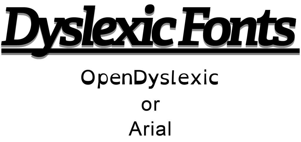
One study looked at Dyslexie font vs. Arial font. Dyslexie font did not improve readability, but they found improved performance when spacing was wider. Another study tested Dyslexia readers’ pace and preference between 12 different fonts while reading various passages. OpenDyslexia had no significant improvement, and people with dyslexia prefer san serif fonts.
Designing for Dyslexic
Designing websites to be inclusive for Dyslexics follow many of the guidelines that good standard design has. Pay particular consideration to keeping text simple, leaving enough space, and creating a strong structure.
Font
The studies above using Dyslexics tend to prefer simpler san serif fonts and avoid using italics or underlines.
Spacing
Having enough space is important for ease of reading for everyone, but people with dyslexia particularly benefit from increased padding between letters, words, and lines.
Structure
The website structure helps Dyslexics both the ability to read and use site readers. Using headlines and breaking text up throughout the page makes it easier for all readers because it follows the F shape reading pattern. It is common for people with Dyslexia to have to use site readers instead of reading themselves, so it is crucial that the writing has structure so the site reader can read aloud in a logical structure.
